Website · Ripples Learning
Ripples Velocity website
The marketing website for Ripples Velocity. Five pages built from the product manager's content, within the brand guidelines, on a style guide I created.

Page 1 of 5
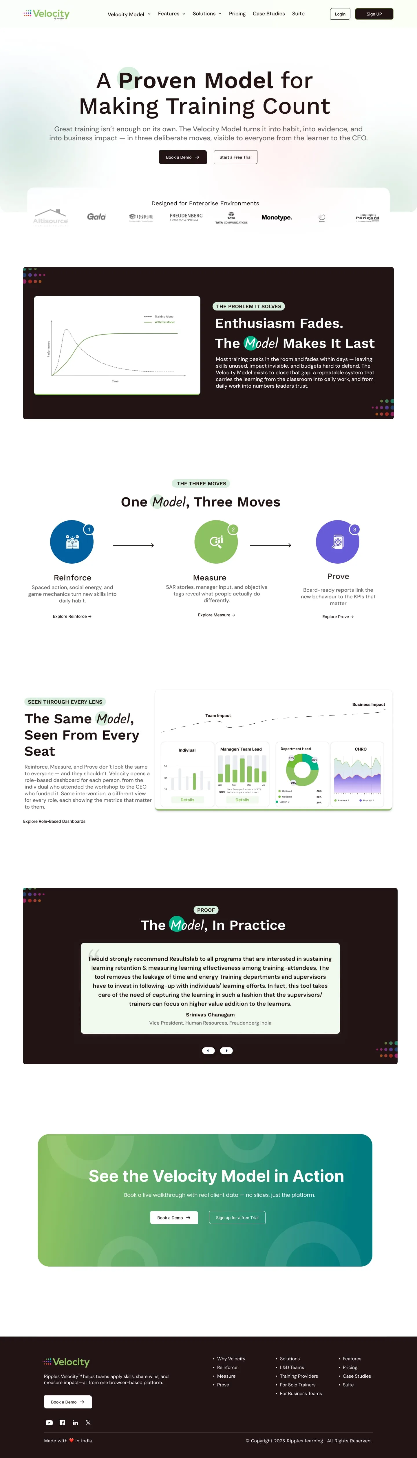
Home
“Why should I care, and is this for me?”
What to look for
- The problem (training fades within a week) before the product
- Reinforce, Measure, Prove as the one idea to remember
- Three audiences, each with their own reason to buy
- Every section ends in Book a Demo or Start a Free Trial
Page 2 of 5
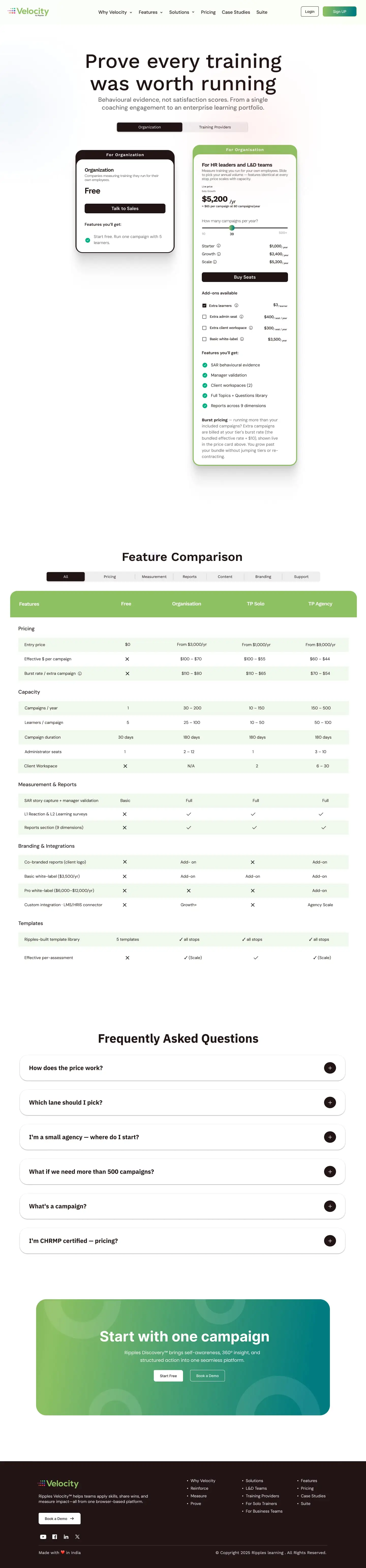
Velocity Model
“How does it actually work?”
What to look for
- One chart shows the problem the model solves
- The same three moves as the home page, now with links to each
- Dashboards for every seat, from learner to CHRO

Page 3 of 5
Features
“What exactly do I get?”
What to look for
- Features grouped by the job they do, not by menu
- Every block pairs a product screen with a short checklist
- Trust and control answered before anyone asks
Page 4 of 5
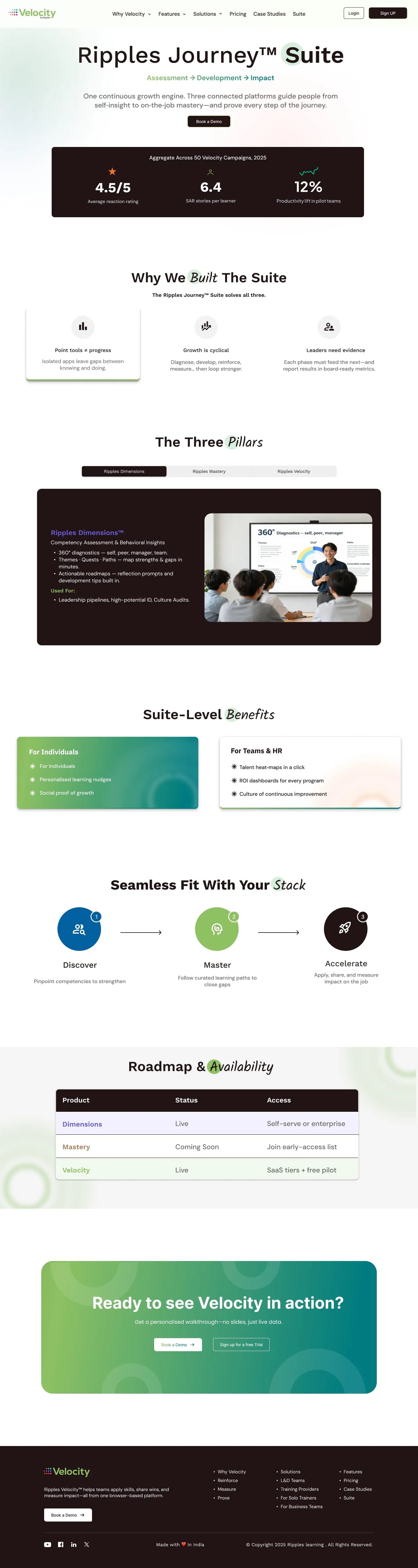
Pricing
“What will it cost me?”
What to look for
- Two lanes, organisations and training providers
- A slider turns a pricing table into one live number
- The comparison table filters by topic
Page 5 of 5
Suite
“How does it fit with everything else?”
What to look for
- Results first, from 50 real campaigns
- Dimensions, Mastery and Velocity as one journey
- A roadmap table shows what is live and what is coming
Pick a page, then scroll inside the window to see all of it.
Context
Ripples Velocity follows people for 90 days after a training programme and shows whether they actually use what they learned. That is a new idea for most buyers, who are used to measuring training with attendance and satisfaction scores. The website had to explain it quickly, speak to three very different buyers (freelance trainers, training companies, and L&D and HR teams), and turn interest into demos and free trials.
How might we make “proof that training worked” feel concrete enough that an L&D leader books a demo?
How it came together
The product manager gave me the content and the requirements. I gathered the details I needed, structured the pages, designed them within Velocity’s brand guidelines, and refined them after each round of feedback.
- Content from the PM
- Requirements
- Page structure
- Design in the brand
- Feedback
- Refine
Feedback and refine, repeated until each page was signed off
Five pages, five questions
Each page answers one question a buyer has, in the order they usually ask them. Click a card to open that page at the top.
- 1 · Home“Why should I care, and is this for me?”Open page ↑
- 2 · Velocity Model“How does it actually work?”Open page ↑
- 3 · Features“What exactly do I get?”Open page ↑
- 4 · Pricing“What will it cost me?”Open page ↑
- 5 · Suite“How does it fit with everything else?”Open page ↑
The home page as a story
The home page leads with the problem, then the answer, then proof, then the next step. Hover or tap a number to see each section’s job.

- 1
Promise
“Make Learning Count”, one line on what Velocity does, and two ways in: Book a Demo or Start a Free Trial.
- 2
The problem
Up to 90% of new learning fades within a week, with three costs every L&D team recognises.
- 3
The answer
A dark band: Velocity is the layer that makes training stick.
- 4
Three moves
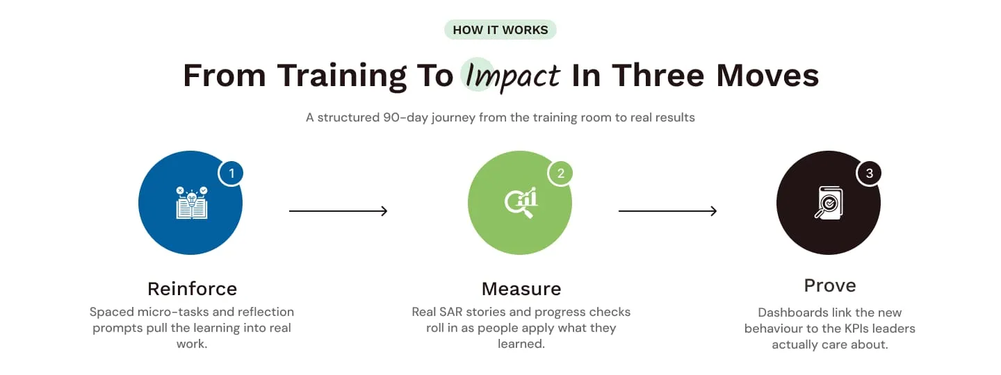
Reinforce, Measure, Prove: the one idea the whole site repeats.
- 5
Who it’s for
Freelance trainers, training companies, and L&D and HR teams, each with its own promise.
- 6
The SAR engine
The heart of the product, Situation, Action, Result, explained with one illustration.
- 7
Learners and managers
Gamification for learners, then manager-verified impact, alternating sides for rhythm.
- 8
A view for every seat
Role-based dashboards, from learner to CEO.
- 9
Proof in numbers
22+ companies, 6,000 impact stories, 100+ programmes, on the brand gradient.
- 10
Wall of love
A real quote from an HR leader.
- 11
Part of something bigger
Velocity alongside Dimensions and Mastery in the Ripples Journey suite.
- 12
Act
“Ready to see Velocity in action?” with the same two buttons as the hero.
- 13
Footer
Links grouped by the buyer’s questions, plus Book a Demo once more.
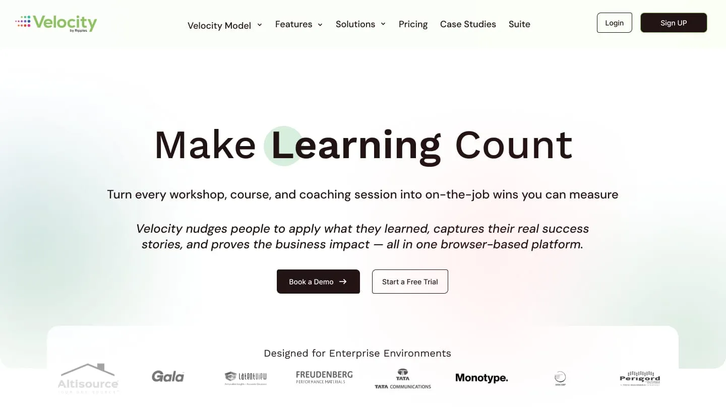
A promise with two doors
- 1
Navigation in the buyer’s words
Velocity Model, Features, Solutions, Pricing and Suite, in the order people ask.
- 2
The accent dot
A soft green dot behind “Learning” is the signature that runs through every heading on the site.
- 3
What, then how
One line on the outcome, then an italic line on how Velocity gets there.
- 4
Two doors
Book a Demo for enterprise buyers, Start a Free Trial for trainers who want to try it themselves.
- 5
Trust straight away
Enterprise client logos sit on a white card that overlaps the hero.
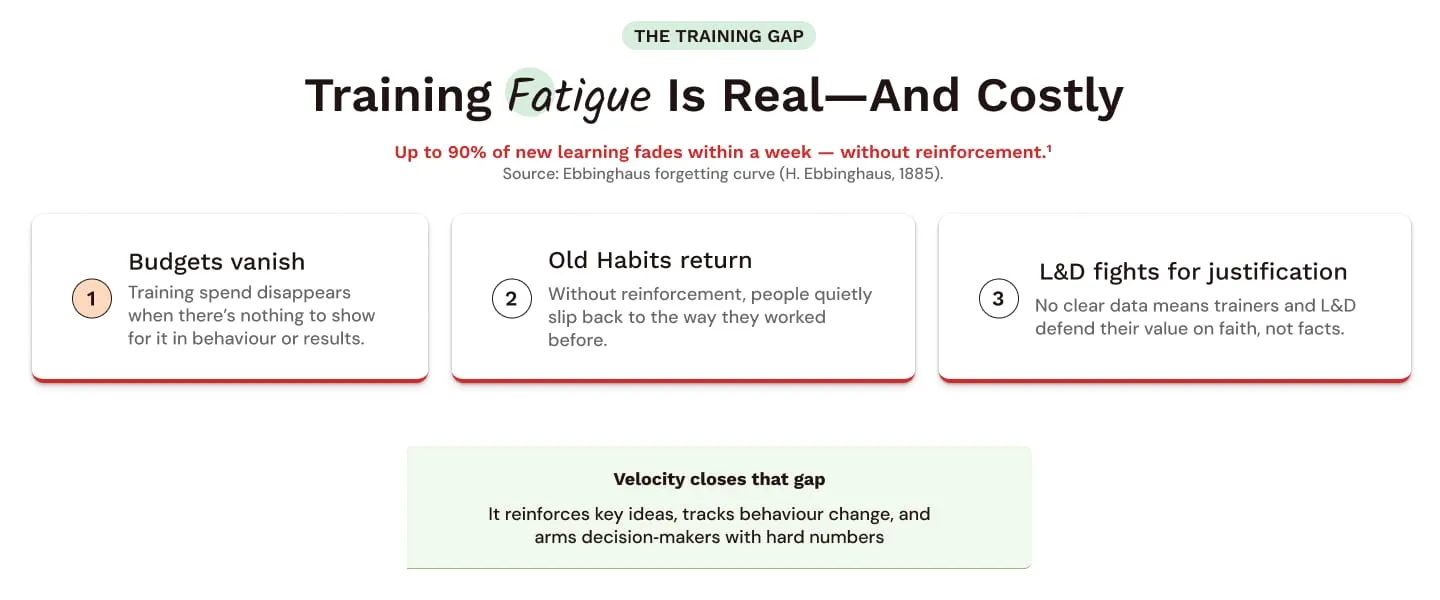
The problem before the product
- 1
Name the pain
“Training Fatigue” is the keyword, in the handwritten accent.
- 2
A fact with a source
The 90% statistic is in red and cites the Ebbinghaus forgetting curve, so it reads as evidence, not marketing.
- 3
Three costs, one red line
Each card has a red underline: the problem, made visible.
- 4
The turn
A calm green box answers the problem before the page moves on.
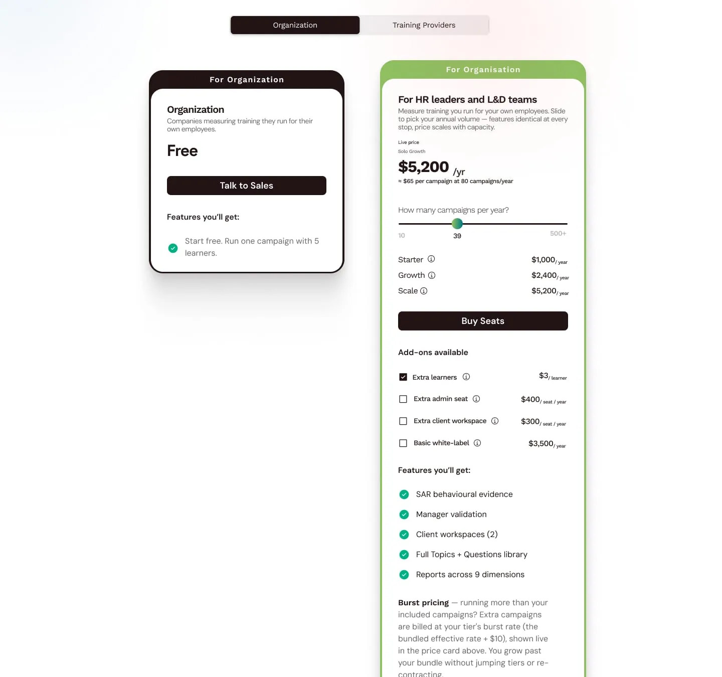
Pricing that answers back
Pricing was the hardest page: two kinds of buyer, three tiers, add-ons and burst pricing. Rather than a dense table, the price card does the maths for you.
- 1
Pick your lane
Organisations and training providers buy differently, so a toggle swaps the whole page.
- 2
Free to start
One campaign with five learners, so nobody has to talk to sales to try it.
- 3
A live price
The yearly price updates as you move the slider, with the cost per campaign underneath.
- 4
One question, not a table
“How many campaigns per year?” is the only input; tiers follow from it.
- 5
Add-ons as checkboxes
Extras are opt-in, each with a unit price and an info tip.
- 6
No surprises
Burst pricing is explained in plain words right on the card.
A style guide behind every page
Before designing the pages, I set up a UI style guide for Velocity within its brand guidelines: colours, type, grid, spacing and every component the site needed, each with its states. Every page was then assembled from these parts. Hover or tap a number to explore the full guide.

- 1
Colours
Two brand colours, four state colours, text greys and soft background tints.
- 2
Typography
Lato, with six heading sizes from 56px to 20px and a 1.1 line height.
- 3
Grid
A 12-column grid on a 1440px frame, 36px margins and 20px gutters.
- 4
Spacing
Ten levels, from 8px to 120px.
- 5
Buttons
Primary, secondary and tertiary, each with default, hover, pressed and disabled states, for desktop and mobile.
- 6
Cards
Four card types, including the gradient primary card.
- 7
Effects
Shadow levels for cards and overlays.
- 8
Accordion
Used for every FAQ on the site.
- 9
Tabs
Used for the pricing toggle and the suite pillars.
- 10
Input fields
Default, focus, filled, error and disabled, with helper text.
- 11
Radio buttons
Every state, at two sizes.
- 12
Checkboxes
Every state, used for pricing add-ons.
- 13
Tooltips
Four directions, light and dark, used for the pricing info tips.
Rebuilt from the guide:
01 · Colour
Primary
#221314
Buttons, dark bands and footer
Secondary
#8dc162
Brand green, gradients and icons
Info
#0260a1
Reinforce, links
Success
#27ae60
Check marks and confirmations
Warning
#e2b93b
Alerts
Error
#dc2626
The problem statistic, errors
Body text
#666666
Paragraphs
Accent tint
#d7eedd
Section labels and the heading dot
02 · Type
- Heading 1 · Lato56px · BoldMake Learning Count
- Heading 2 · Lato48px · BoldTraining Fatigue Is Real
- Heading 4 · Lato32px · BoldThe SAR Reflection Engine
- Accent word40px · SemiboldImpact
- Heading 6 · Lato20px · BoldFreelance Trainers
03 · Components
Buttons · four states each
Section label
How it worksPrimary card
Ready to see Velocity in action?
Three moves
One signature, every heading
Like the Ripples Learning site, each heading picks one keyword, sets it in a handwritten accent and puts a soft dot behind its first letter, here in Velocity’s green. It ties Velocity to the Ripples family while keeping its own colours.
Training Fatigue Is Real
From Training To Impact
The Layer That Makes Training Stick
Built For Everyone
What Gets Captured
Everything A Campaign Needs
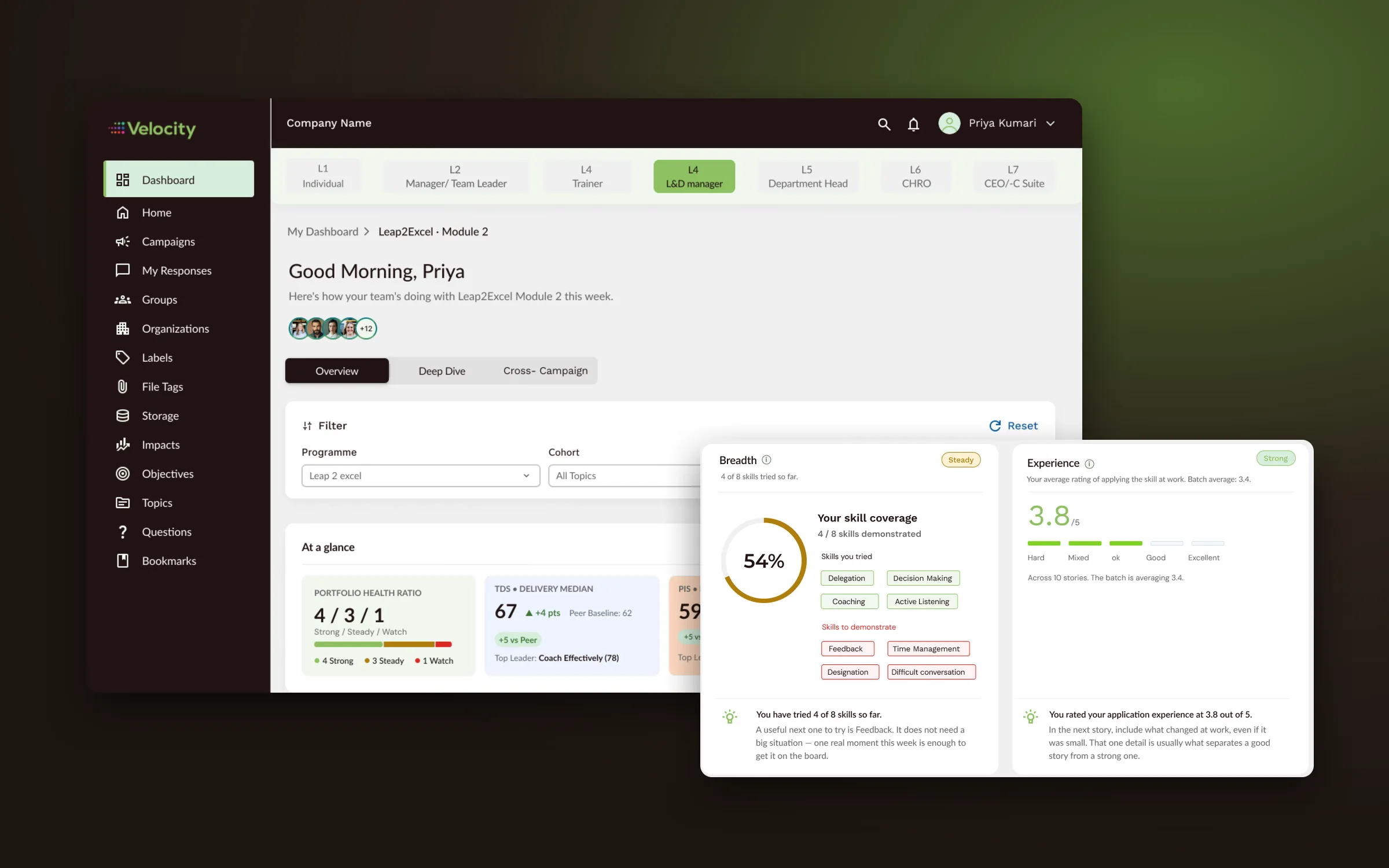
The product behind the website
I also designed the Velocity product itself. The website’s promise, “prove what training changes”, is what the product’s dashboards deliver.
Result
A five-page website that explains a new idea in plain words, speaks to three kinds of buyer and ends every page in a demo or a free trial, built on a style guide and refined through the product manager’s feedback.